Perhaps you've followed Joanna Gaines from the beginning on her hit HGTV show Fixer Upper, or maybe you've found yourself binge watching the last 2 seasons in one week while sitting on the couch with your newborn.. oh wait... that was me! Either way you found her... you just fall in love with Joanna's design style and the on screen antics of her hubby Chip. I personally am constantly amazed at the changes they make in the dilapidated Fixer Uppers and I instantly want to take a sledge hammer to a wall in my own home. Her decorating style is delightfully southern, comfortable, and easily obtainable in almost any price range. It's easy to see that Joanna is the newest powerhouse in the world of decorating and her influence can be seen in all of your favorite home stores. Her trademark rustic style consist of over-sized Vintage Letters, Magnolia Wreaths, Inspirational Quotes as art, Open Concept Floorplans, and last but not least Shiplap!!! Here's a breakdown of how you can easily recreate Joanna's style in your home!
1. Simple Colors:
Joanna certainly isn't going to produce a space with lots of bold colors. You'll have to leave that to Jonathan Adler. Instead JoJo uses blushy colors and adores shades of white and gray. So don't be afraid of white: white trim, white walls, white ceilings. Layer shades of white & creams. Add in unexpected elements like metals and reclaimed wood. When she does use color, it's typically pale and provides a soothing feel to the space. Opt for chalk, flat or eggshell finishes.
2. Woods... Reclaimed and Distressed:
Shes known for grabbing that rustic board and with the help of Clint of Harp Design Co, she turns it into a gorgeous farmhouse table. Joanna also loves wall to wall wood floors instead of carpet, giving the space an open continuous flow with fewer transitions in materials. This helps smaller spaces feel larger and is perfect for open concept spaces. Her combination of wood, metal, and painted surfaces stay casual yet very beautiful.
 |
| photo credit: HGTV Fixer Upper |
3. Metals:
One of my favorite episodes was where Joanna took on Mid Century Modern. It's a design style every designer secretly wants to tackle at least once in their career... and I'm still waiting on my chance. Joanna still kept true to her southern style and gave us a home to die for! Throughout the home as well as many of her Fixer Uppers, she incorporated metal. There's some shapes that wood just can't create, that's were metal comes in. Whether its in a thin streamline application of a coffee table leg or as an eye catching chandelier, metal is always appropriate. Don't be afraid of mixing metals and woods. The wood will balance it and make it feel more rustic or contemporary, depending on its finish, grain, and texture. To me, the piece will reflect the style, but if your having trouble understanding where to start try these tips:
- Chrome, Polished Nickle, Brass, or Brushed Brass- For added glam and opulence
- Choose black or bronze- for a more rustic feel
- Choose Brushed Nickle or Stainless Steel for ease to match up with everything
- Some metals cost more and some are not as easy to find.
 |
| Photo Credit: HGTV Fixer Upper |
 |
| Photo Credit: MagnoliaHomes.net |
4. Unexpected Art
I love it when Joanna takes the unexpected item and turns it into 3D art! To me it adds such flavor to a room. A real one or a kind element that gets people talking. Now not all of us are going to be able to get away with putting a windmill blade on the wall. So when picking out this item... think about something that might fit your area, your personality, or something you enjoy. My tip: Go big or go home. All too often I see the mistake of too small of are for the wall. That's what makes the windmill so impressive. The scale is substantial enough to fit the console beneath and the wall its against.
Here on the coast you may opt for:
- a collection of vintage boat oars
- framed vintage swim suits
- shadow boxes of shells and beachcomber finds
- heirloom fishing rods, clam rakes & other fishing collections
- sail cloth and nautical flags
 |
| Photo Credit: HGTV Fixer Upper |
5. Re-imagined Elements
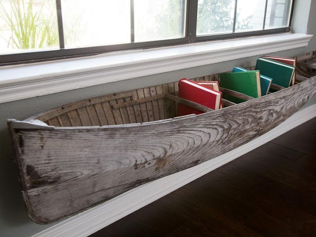
Kind of a similar topic as her use of 3 dimensional art. Joanna always thinks outside the box and will come up with a new way to use something like a boat as a bookshelf or galvanized exterior awnings on the inside in place of window coverings.
 |
| Photo Credit: HGTV Fixer Upper |
6. The JoJo Touch
Joanna has several trademark accessory touches when it comes to staging her homes. She loves to add antique finds and use them in unconventional ways. She adds earthy touches in the form of magnolia wreaths or vases of cotton stems. Shes quick to snatch up vintage metal letters and spell out words on the wall. So when shopping for her look, don't pass up on ...
- Galvanized Anything: buckets, signs, lights and more
- Glass Vases, bottles & Jars:
- Cotton Stems, Magnolia Leaves, and Yellow Almond Sprays
- Vintage Books: She is gaga over old books
- Old Windows with lots of character
- Weathered Candlesticks
- Trays & Crates in wood or metal
- School Desk & Church Pews
- Industrial Lighting
7. Shiplap
Lord... that girl loves Shiplap. It's a bit harder to find here on the Outer Banks but if you are lucky enough to come across it in your renovating- Save it! More commonly we see flat 80's paneling or Tongue and Groove Juniper or Pine paneling. Well Joanna would certainly slap paint on it in a hurry. It quickly brightens a room and changes the look. She loves to see walls covered in wood, beadboard, and/or some sort of siding. If your home or budget can't lend itself to wall-to-wall wood, then try an eye catching accent wall instead. A great place to start might be on a wall with a fireplace or behind the master bed. Or opt for a wallpaper application like I did for my son's nursery. There are all sorts of textured and/or printed wall papers that look like rustic barnwood. Find what fits your style, timeline, and budget.
 |
| Photo credit: HGTV Fixer Upper |
8. Hometown Support
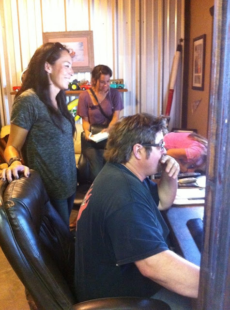
I don't know about you, but I had never heard of Waco Texas before Fixer Upper. Joanna Gaines has certainly put her town on the map, and that goes for the mix bag of characters who work with her. Like Clint- the master craftsman behind many of Joanna's beautiful farmhouse tables, or Jimmy Don who takes sheet metal and JoJo's words of inspiration and creates art. Chip and Joanna have accumulated a group of craftsman and entrepreneurs who help her be as creative as she is. Which brings me to my next tip- support your local economy whenever possible! Perhaps because I grew up on an island and larger corporate store influences aren't as big her on the Outer banks, but this just seems like a no brainier. Who doesn't love hometown pride? It's what can make a purchase special and memorable. So before you run off and buy cookie cutter mass produced items from the closest big box decor shop, stop and look up local artisans who can help you create what you are looking for. I promise you- you will have such a fun time designing what you need and also its great to support folks in your area.
 |
| Joanna Gaines & Clint creating Fixer Upper magic. |
 |
| Joanna Gaines & Jimmy Don creating words of inspiration. |
9. Open Concept
One of my favorite episodes is the season 2 finally- "The Asian Ranch." Joanna took on a dated ranch and had Chip tearing down walls faster than you can say Demo Day. The end result was a beautiful French Country styled home with a spacious Open Concept that is perfect for entertaining. The idea of open concept floorplans really gets tongues wagging with love or hate discussions. Open concepts are all the rage already on the Outer Banks in the modern reverse floorplan homes, which have wide open sightlines within the great rooms to enjoy coastal views. Even if you don't have a million dollar water view, an open concept may be just what you need. Here's how to tell if an open concept is right for you...
- Do you love entertaining?
- Do you wish your small home felt larger?
- Do you have a large family?
- Do you wish you could be a part of family instead of chained to the kitchen alone each night? (Can you tell which one strikes me?)
 |
| Photo By: Jennifer Boomer/Getty Images HGTV Fixer Upper |
 |
| Photo By: Jennifer Boomer/Getty Images HGTV Fixer Upper |
10. Family
On a personal note: Joanna Gaines has really become such an inspirational woman to me this year. Its a rare occurrence to see interior designers/moms. I don't know why, but out of all the woman I have worked with over the past 8 years, none of them have children. So I was beginning to wonder if motherhood and interior design go together.... but boy has Joanna proved that one wrong. So not only has she become an inspiring designer, she also has inspired me to passionately pursue interior design. Sure I often think... I'm exhausted and can't think of one artistic vision... but hey JoJo did it with 4 kids.
Chip and Joanna put family first! Joanna has mentioned that the farmhouse was completely designed to be family friendly. As we all know... when flipping through magazines, pinning on pinterest, or watching home shows...there is always a difference in homes that are family friendly and homes that are not! With Joanna's designs its hard to determine a difference. They are all beautiful but I especially love that she creates room for children in homes. I know all too well now how kids take over a home. I have dedicated baskets for my son's toys in the living room and plan on adding a cabinet/mini room for him under the staircase. Kids are a part of your life and it's just such a short time, so enjoy it! Come up with creative ways that incorporate your children into your home. Here are some ideas...
- Have a chalkboard wall
- Give them a table in the kitchen for crafts or a place to do homework
- Give them a kitchen cabinet(perfect for little ones to rummage through)
- Scan a piece of the kids art and have it printed on pillows or framed
- Opt for kid friendly fabrics, rugs, and wall paint
Check out Chip and Joanna Gaines on HGTV Fixer UpperSeason 3 starts Tuesday December 1st!


